Things We Hate About the USPTO.GOV Website, #1
Posted by Stephen M. Nipper at October 10, 2005 01:29 PM
We've joked a number of times internally about things we hate about the USPTO's website and how we should compile a list of grievances. Today I stumbled onto one of the things I "hate" and it spurred me to start the list...
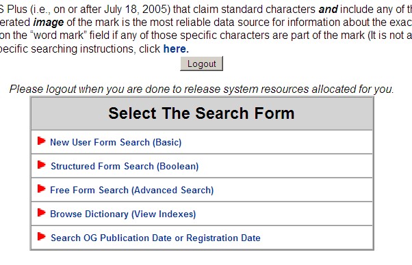
Grievance #1: Why in the world is the "LOGOUT" button above the search form boxes on the trademark search page (picture below). I don't know how many times I have loaded that page in a hurry and clicked that button by mistake like it was a "NEXT" or "ENTER" button. I think it is akin to putting a "delete all" button right next to a "save" button. ARGH!
What drives me nuts is that the Logout button is the first thing you see when you come to the page...just in case you changed your mind before you do the search and want to logout.

Feel free to send your own grievances over and we'll add them to the list.


 J. Matthew Buchanan
  Stephen M. Nipper
  Douglas Sorocco
Trackback
You can ping this entry by using http://www.phlexability.com/mt/mt-tb.cgi/202 .
USPTO's website is http://www.uspto.gov. Guess what happens when you go to http://uspto.gov. If you guessed "The page cannot be displayed," give yourself 10 points. If you've ever typed in uspto.gov and received the same error before, give yourself and...
Trackbacked from Things We Hate About the USPTO.GOV Website, #4 on Rethink(IP).
Comments
Shelia R. Carter Says:
October 10, 2005 04:18 PM
I really hate the way that it [USPTO]knocks me out of driving over 100 miles to the nearest U.S. state patent depository...it was fun to travel a couple of hours before using the microfiche machine to search for individual patents and/or inventors...and that darn cross-reference feature just takes all the challenge out of finding out if the two components in mind met before in someone else's mindset. Wonder who's bright idea it was to even include it on the internet, anyway. And now to make things even more complicated...one may apply online...just like that. No more wondering if the piece of mail made it to their processing center or not...BOOM ... it's there! Next thing they will probably announce the patents that are awarded each day to further complicate matters...it would be like, "dang and I was just about to send the $75.00 and application for a thing similar to that one shown online"...no more wasted dollars for items similar to the one's already submitted AND approved. WHAT NEXT!? THE CONVENIENCE AND EASE OF USE IS MADDENING!!!!! aaaaaaAAAAAUUUUUUUUUUUGGGGGGGGHHHHHHH!
Josh Says:
October 11, 2005 08:56 AM
Why do they even have a logout button anyway? I don't even remember logging in, so how can I logout?
I hate the way the trademark search sessions timeout. I'll be poking around in the database looking for something for a client. Turn to another window to jot some notes, come back and find out my session is over.
Irritating.
Nipper Says:
October 11, 2005 06:21 PM
Thanks for the comment. I totally agree. The other stupid thing is that if you hit the logout button or if you time out it doesn't take you back to the log in page (if there was one) but dumps you back to the main trademarks page...where you have to search through what seems like a zillion links to find the "search" link again. Argh.
Mike Brown Says:
November 17, 2005 09:23 AM
While you're on the USPTO search pages, would it be too much effort to use the same syntax on the patent and trademark free-form searches? They're two-letter field codes in both, but one uses a prefix followed by a slash, and the other uses a suffix enclosed in brackets.